

Introduction
Chances are, you are in quarantine right now and the reason for that is the coronavirus, also known as COVID-19. Now I am not a medical expert, nor am I a political expert or an expert for societal issues. So I don’t want to talk too much about the effects that the virus has or might have in the future on those levels. In this blog post I want to show you how you can analyze the coronavirus from a mathematical and statistical perspective in Python, using data science. We are going to visualize the actual numbers and also make some simulations and estimations of the future development of the virus.
Loading And Preparing The Data
Before we can actually do some analysis of the virus, we will need to get some recent data and structure it in a way in which we can work with it. For this you can pick any data source you like. You could even go to websites and just web scrape the data from there. However, I we are going to use the datasets of the Humanitarian Data Exchange, since they pack accurate and current data into CSV files.
Datasets: https://data.humdata.org/dataset/novel-coronavirus-2019-ncov-cases
In particular we are going to download the first three files, which include data about confirmed cases, deaths and recoveries. We place them into the same directory of our Python script.
The two libraries that we are going to need are Pandas and Matplotlib. So we are going to import them now.
import pandas as pd
import matplotlib.pyplot as plt
After that we can load the CSV files into our script with Pandas and then display their structure.
confirmed = pd.read_csv('covid19_confirmed.csv')
deaths = pd.read_csv('covid19_deaths.csv')
recovered = pd.read_csv('covid19_recovered.csv')

print(confirmed.head())
The output looks like that:
  Province/State Country/Region      Lat  ...  3/26/20  3/27/20  3/28/20
0            NaN    Afghanistan  33.0000  ...       94      110      110
1            NaN        Albania  41.1533  ...      174      186      197
2            NaN        Algeria  28.0339  ...      367      409      454
3            NaN        Andorra  42.5063  ...      224      267      308
4            NaN         Angola -11.2027  ...        4        4        5
As you can see, we have some initial columns including data like the country or the region and the province or the state. Then after the first four columns we have the dates and the respective confirmed cases (or deaths or recoveries) for that day.
For reasons of simplicity we are going to drop the ‘Province/State’ column and add up the values of all rows of the same country. Also we are going to get rid of the ‘Lat’ and the ‘Long’ columns, which are the coordinates. After that we also want to transpose the data frame. This means we want to have the dates as rows and the countries as columns.
confirmed = confirmed.drop(['Province/State', 'Lat', 'Long'], axis=1)
deaths = deaths.drop(['Province/State', 'Lat', 'Long'], axis=1)
recovered = recovered.drop(['Province/State', 'Lat', 'Long'], axis=1)

confirmed = confirmed.groupby(confirmed['Country/Region']).aggregate('sum')
deaths = deaths.groupby(deaths['Country/Region']).aggregate('sum')
recovered = recovered.groupby(recovered['Country/Region']).aggregate('sum')

confirmed = confirmed.T
deaths = deaths.T
recovered = recovered.T
Calculating Key Statistics
With the data we now have, we can calculate a lot of different additional values. For example, since we have the deaths and the confirmed cases, we can calculate the death rate by country. The same can be done with recoveries. Also, looking at the confirmed cases, we can look back one day and calculate the growth rate of both deaths and confirmed cases. And last but not least we can also calculate the number of active cases by subtracting the deaths and recoveries from the confirmed cases.
new_cases = confirmed.copy()

for day in range(1, len(confirmed)):
    new_cases.iloc[day] = confirmed.iloc[day] - confirmed.iloc[day - 1]

growth_rate = confirmed.copy()

for day in range(1, len(confirmed)):
    growth_rate.iloc[day] = (new_cases.iloc[day] / confirmed.iloc[day - 1]) * 100

active_cases = confirmed.copy()

for day in range(0, len(confirmed)):
    active_cases.iloc[day] = confirmed.iloc[day] - deaths.iloc[day] - recovered.iloc[day]

overall_growth_rate = confirmed.copy()

for day in range(1, len(confirmed)):
    overall_growth_rate.iloc[day] = ((active_cases.iloc[day] - active_cases.iloc[day-1]) / active_cases.iloc[day - 1]) * 100

death_rate = confirmed.copy()

for day in range(0, len(confirmed)):
    death_rate.iloc[day] = (deaths.iloc[day] / confirmed.iloc[day]) * 100
Don’t be confused because of the amount of code. We are doing the almost same thing over and over again. We are just making a copy of the confirmed cases data frame and then changing its content with the formula needed for the respective values. For the death rate, we just divide the amounts of deaths by the amounts of confirmed cases and multiply the result by 100. For statistics, where we need to look back one day to do some calculations (i.e. growth rate), we start the loop at index one.
One thing that is essential here is that you use the copy function and don’t just assign the data frame. Because otherwise you will pass a reference to it and when you change the new data frame, you will also change the original.
Making Estimations
Another thing we can now do is make some estimations and do further calculations based on them. Notice that these estimations don’t have to represent reality. They are just numbers that we think might be realistic. For example, some experts say that 5% of coronavirus patients will need a hospital bed, because their infection will be severe. Based on that number, we could calculate how much hospital beds will be needed over time and when the capacities of the individual countries will be exhausted.
hospitalization_rate_estimate = 0.05

hospitalization_needed = confirmed.copy()

for day in range(0, len(confirmed)):
    hospitalization_needed.iloc[day] = active_cases.iloc[day] * hospitalization_rate_estimate
The mystery of Italy’s rising death rate might also be analyzed with estimations. Of course the death rate increases when the capacities of the health care system are exhausted. But another reason for an increasing death rate in the statistics could be that way more people are infected than tested and confirmed. We could have ten times more cases than we know about. But we will almost certainly find out about every death. Thus the death rate in the statistics will be higher than in reality. Here we can work with the estimated death rate. Most experts say that COVID-19 has a death rate between 2-4%. If that is true, we could use that number and reverse engineer the amount of actual infected people in countries like Spain or Italy.
estimated_death_rate = 0.03
print(deaths['Italy'].tail()[4] / estimated_death_rate)
In this case we assume a mortality rate of 3% and the print statement gives us the estimated number of people that are actually infected.
Visualizing The Data
Now let us get into some visualizations to see what this data actually looks like. First we are going to plot the total confirmed cases for multiple countries.
ax = plt.subplot()
ax.set_facecolor('black')
ax.figure.set_facecolor('#121212')
ax.tick_params(axis='x', colors='white')
ax.tick_params(axis='y', colors='white')
ax.set_title('COVID-19 - Total Confirmed Cases', color='white')
ax.legend(loc="upper left")

countries = ['Austria', 'Italy', 'US', 'Spain', 'China', 'Germany', 'India']

for country in countries:
    confirmed[country][0:].plot(label = country)

plt.legend(loc='upper left')
plt.show()
The result is the following:
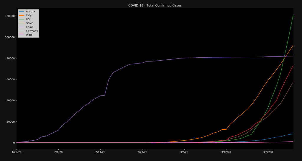
You can see that most coutries had almost no cases in January and February but skyrocketed in March. On the other side you can see China, which had its exponential growth in January and February and barely gets any new cases anymore. It’s up to experts to analyze and predict if such a curve can be expected in the rest of the world. I personally don’t see that happening that fast.
Feel free to insert other data frames like deaths and recoveries. I am not going to plot all of these here, since it would just be annoying. Run the code yourself. However, there are certain statistics that are better plotted in a different way. For example the death rates or the growth rates. For those it makes more sense to plot one country at a time and to use bar charts.
countries = ['Austria', 'Italy', 'US', 'China']

for country in countries:
    ax = plt.subplot()
    ax.set_facecolor('black')
    ax.figure.set_facecolor('#121212')
    ax.tick_params(axis='x', colors='white')
    ax.tick_params(axis='y', colors='white')
    ax.set_title(f'COVID-19 - Overall Active Growth Rate [{country}]', color='white')
    overall_growth_rate[country][10:].plot.bar()
    plt.show()
Here we visualize the overall active cases growth rate. Meaning the growth rate of the confirmed cases minus the deaths and the recoveries. Notice that we start visualizing from day ten, in order to skip some of the initial days.
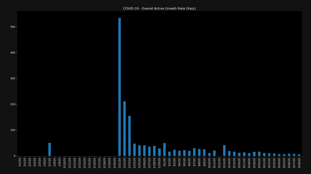
For most countries, the chart will look pretty similar to this one. We have a high spike in the growth rate at the beginning and then it slowly gets smaller. Notice however that this is still a positive growth rate. Also notice that the growth rate on the right is still around 10%.
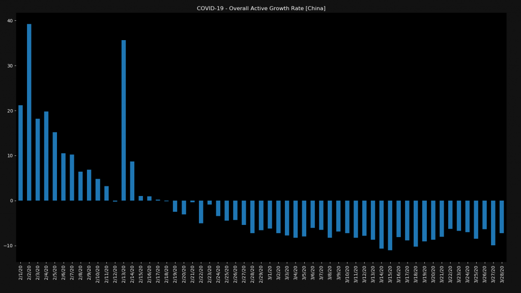
In very few countries like China, you can actually see a negative growth rate, which means that not only are people getting sick slower but that the number of active cases is decreasing every day.
Running Simulations
Last but not least, we can run some simulations. Let’s say we want to see what would happen if we had a constant growth rate of 10% in Italy from today on. What would the next 40 days look like?
simulation_growth_rate = 0.1

dates = pd.date_range(start='3/29/2020', periods=40, freq='D')
dates = pd.Series(dates)
dates = dates.dt.strftime('%m/%d/%Y')

simulated = confirmed.copy()
simulated = simulated.append(pd.DataFrame(index=dates))

for day in range(len(confirmed), len(confirmed)+40):
    simulated.iloc[day] = simulated.iloc[day - 1] * (simulation_growth_rate + 1)
Here we set a fixed growth rate, create the dates for the next 40 days and then calculate the new cases based on a daily 10% increase. We can now go ahead and visualize that.
ax = simulated['Italy'][10:].plot(label="Italy")
ax.set_axisbelow(True)
ax.set_facecolor('black')
ax.figure.set_facecolor('#121212')
ax.tick_params(axis='x', colors='white')
ax.tick_params(axis='y', colors='white')
ax.set_title('COVID-19 Italy', color='white')
ax.legend(loc="upper left")

plt.show()
The result is the following:
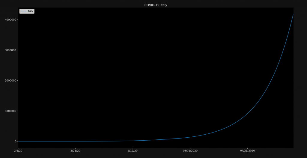
The number of infected people would then be four million. Of course this doesn’t take any counter-measures into account. Also this formula is blind to natural limits like population size. If you choose 20% and run this for a longer time, you will have infected more Italians than there are people on earth. Therefore this simulation is not at all accurate. But you can play around with ideas like this one.
Conclusion
So why is all of this even important? What is the conclusion of it? Why care about it? Event though I said this blog post is purely educational and should just teach you to analyze data sets with Python and Pandas, the data is quite concerning. If the growth rate remains high, the death rate will also increase because of limited health care capacities. And since we have no vaccine or effective medicine yet, the only way to reduce the infection rate is our behavior. If we wash our hands, practice social distancing and stay at home, we can help fight this disease. So do yourself and especially other people a favor and stay home if you can! Thank you! 🙂
I hope you enjoyed this blog post! If you want to tell me something or ask questions, feel free to ask in the comments! Down below you will find some additional links leading to more content. Check out my Instagram page or the other parts of this website, if you are interested in more! I also have a lot of high-quality Python programming books in the book section! Stay tuned!
Check out the detailed video version of this tutorial!

Follow NeuralNine on Instagram: Click Here
Subscribe NeuralNine on YouTube: Click Here


thanks for such a easy n nice tutorial , i have a doubt , i want to add growth rate in plot per date wise can you kindly assist me for the same
Hola como estudiante de informática en Chile encuentro tu trabajo muy bueno e interesante, sigue así