
Introduction
Candlestick charts are one of the best ways to visualize stock data because they give us very detailed information about the evolution of share prices. In fact, they give us information about four major values at the same time. In this tutorial, we are going to implement a candlestick chart visualization using Python because it is a great choice for financial analysis and data science. This is due to the powerful libraries like Matplotlib, NumPy and Pandas.
We are going to write a little script that plots a professional candlestick chart for a specific company at the stock market. If you are not familiar with the concept of that diagram type, take a look at the following image. There you can see two different types of candlesticks.
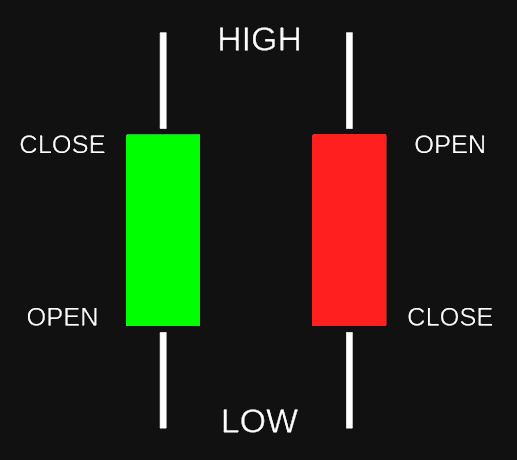
As you can see, a candlestick can be either positive (green) or negative (red). The former means that the close price is higher than the open price and the latter means the opposite. We can gather four different values out of one candlestick:
- The highest share price of that day (top point of the white line)
- The lowest share price of that day (bottom point of the white line)
- The share price when the market opened (top point of the red area or bottom point of the green area)
- The share price when the market closed (top point of the green area or bottom point of the red area)
Additionally, we can also look at the price span of the respective day which is visualized in the colored area. Thus, this type of chart provides a lot of information.
Imports
For our script we will need to import a couple of libraries. Most of them are external and need to be installed.
import datetime as dt
import matplotlib.dates as mdates
import matplotlib.pyplot as plt
import pandas_datareader as web
from mpl_finance import candlestick_ohlc
Let us take a quick look at each of these:
- datetime: We will use this one to define our desired time span
- matplotlib.dates: This library will convert our dates into the necessary number format
- matplotlib.pyplot: Will be used for displaying our chart in the end
- pandas_datareader: The module that will load the desired stock data
- candlestick_ohlc from mpl_finance: Our main library for plotting
Except for the datetime module, none of these libraries is included in Core Python. This means that you will need to install them with pip. For detailed information click here!
Preparing The Data
In order to plot our data properly, we will first need to load it and to set it up. We will start by defining our desired time span.
start = dt.datetime(2010,1,1)
end = dt.datetime.now()
Our start date is January 1st, 2010 and our end date is defined as the current date. This means that we are looking at the data from our start date up until now. The next step is the definition of our data reader.
df = web.DataReader('AAPL', 'yahoo', start, end)Here, we specify that we want to use the Yahoo Finance API in order to download the data for the ticker symbol AAPL (which is Apple). The time span we are looking at is defined by start and end. What we get is a data frame that contains our requested values. We can print out the first few rows to see the structure.
print(df.head()) High Low Open Close Volume Adj Close
Date
2010-01-04 30.642857 30.340000 30.490000 30.572857 123432400.0 20.386072
2010-01-05 30.798571 30.464285 30.657143 30.625713 150476200.0 20.421322
2010-01-06 30.747143 30.107143 30.625713 30.138571 138040000.0 20.096491
2010-01-07 30.285715 29.864286 30.250000 30.082857 119282800.0 20.059338
2010-01-08 30.285715 29.865715 30.042856 30.282858 111902700.0 20.192701Right now, we have two columns that we don’t need for our chart. These are Volume and Adj Close. For our candlestick chart, we need the values Open, High, Low, and Close in that exact order. Also, we will need Date for our x-axis. In pandas, it is quite simple to select and reorder columns in a data frame.
df = df[['Open', 'High', 'Low', 'Close']]Basically, we are just selecting the four relevant columns in the right order and replacing our current data frame. Notice that we use double square brackets here.
Now, we have our columns in the right order but there is still a problem. Our date doesn’t have the right format and since it is the index, we cannot manipulate it. Therefore, we need to reset the index and then convert our datetime to a number.
df.reset_index(inplace=True)
df['Date'] = df['Date'].map(mdates.date2num)
So what we do is, we drop the index and map the date2num function onto our Date column. Now, our datetime values are converted into numbers that matplotlib can deal with. We can start with the plotting.
Plotting The Data
For the final step, we will define our plots and visualize the data we have prepared.
ax = plt.subplot()
candlestick_ohlc(ax, df.values, width=5, colorup='g', colordown='r')
ax.xaxis_date()
ax.grid(True)
plt.show()
First, we define a new subplot (also called axis) for our data. Then, we use the candlestick function, in order to plot our values. Also, we define the colors and the width of the sticks and we put the dates on the x-axis and turn on the grid.
Now, to make our chart look a bit more professional, we will make some changes in its style.
ax = plt.subplot()
ax.grid(True)
ax.set_axisbelow(True)
ax.set_title('AAPL Share Price', color='white')
ax.set_facecolor('black')
ax.figure.set_facecolor('#121212')
ax.tick_params(axis='x', colors='white')
ax.tick_params(axis='y', colors='white')
ax.xaxis_date()
What we do here first is to place the grid below the candlestick chart itself. After that we define a title for our plot. Then we set the background of the figure but also of the plot itself to a dark gray color. Of course we also need to set the color of the axis-ticks to white. Finally, we show our plot. After these style changes, the end result looks like this:
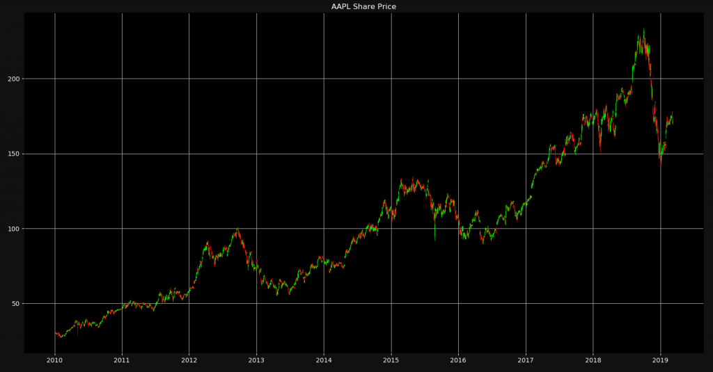
Of course, the more you zoom in, the more you will be able to see the individual candlesticks. This is a great way to visualize four different values in a single chart.
I hope this tutorial was helpful to you! You can check out the detailed YouTube video for this tutorial. Also you can download the source code or follow NeuralNine on Instagram.
Check out the detailed video version of this tutorial!


Their is a error obtained when i run this program
KeyError: “None of [Index([‘open’, ‘high’, ‘low’, ‘close’], dtype=’object’)] are in the [columns]”
so please give me the solution f this problem.
It seems like the problem is that you are writing the first letters of the column names in lower-case. Try changing that.
Great article thank you! Clear explanations too. Keep it up!
Thank you very much for your feedback! I hope it helped you!
thank you so much it helped me a lot, but i am want to only print candle stick chart with dates, how can i do that??
I am very glad it helped you! I think what you are asking for is already implemented. You are already printing the dates but you need to shorten the time frame or zoom into specific parts of the plot in order to see the months and days as well.
It was excellent tutorial please let me to plot the moving average inside the candlesticks charts
how can i change the web site (instead of yahoo) i want to use http://www.bolsasantiago.com but a dont know how to do it
how can I show the volumn?
It’s nicely explained. I have a request related a to this tutorial. Is it possible if you can create a tutorial similar on how to access and handle websocket data from kraken and plot the animated chart from the data.
I’ve been exploring for a bit for any high-quality articles or weblog posts in this kind of area
. Exploring in Yahoo I eventually stumbled upon this website.
Reading this info So i’m satisfied to convey that I’ve an incredibly just right uncanny feeling I came
upon exactly what I needed. I such a lot no doubt will make sure to don?t disregard this website
and provides it a glance on a continuing
basis.
How do I add tooltip to mplfinance candlestick plot. Is it possible to integrate mpld3 in mplfinance for tooltip, if so, how?
Since mplfinance does not provide tooltip feature, so can I integrate mpld3 to add tooltip to mplfinance plot, if so how?
Is there a way to color each day separately based on an additional parameter?
for example the size of the candle (blue if abs(high-low) > abs(high-low) of previous day.
I got here ’cause there are errors and a lot of people are complaining about and asking for help in your video https://www.youtube.com/watch?v=PuZY9q-aKLw
and not a single reply.
What’s the use of letting people behind?