
Introduction
Classification is a supervised learning process that categorizes data into classes. One of the most popular classification algorithms in machine learning is the K-Nearest Neighbors classification. As the name already tells us, this algorithm works by looking at the nearest neighbors of a point to determine its class. In the following image, you can see what this looks like.
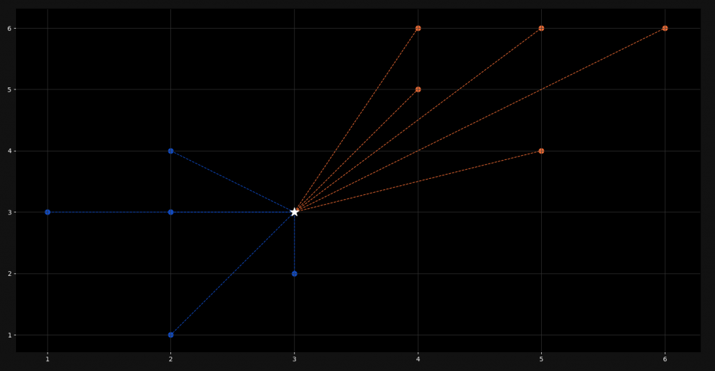
When training our model, we give it a lot of already classified examples. These are the colored points in the plot. When we add a new point (represented by the white star), it calculates the distance to all the points and takes on the class of the nearest k amount of points.
In this tutorial, we are going to understand the mathematics behind this algorithm and implement it in Python from scratch. We are not going to use external machine learning libraries like Scikit-Learn or Tensorflow. They won’t give us any understanding of what is really happening here.
Perquisites
Although we are programming this algorithm from scratch, we are going to use two data science libraries, namely NumPy and Matplotlib. We will use NumPy for working with arrays and Matplotlib for graphing and visualizing our model.
import pandas as pd
import matplotlib.pyplot as plt
Other than that, you will not need a lot of other skills here. Of course a basic understanding of high-school mathematics would be benefitial but for this particular model, we don’t need anything but square roots and the sigma notation.
Euclidean Distance
Now the basis of the K-Nearest Neighbors algorithm is the so-called euclidean distance. This is the distance between a new point and all the other points that we need to calculate. Actually it is quite simple and if you understand the Pythagorean Theorem, you will also understand this formula.
d(p,q) = \sqrt{\sum_{i=1}^n (q_i – p_i)^{2}}
=\sqrt{(q_1-p_1)^{2}+(q_2-p_2)^{2}+…+(q_n-p_n)^{2}}
Don’t get confused here! It is way simpler than it looks in the first moment. Basically, to calculate the distance between two points, we just calculate the distance on each axis, square it and add it to the other differences. Let me illustrate this.
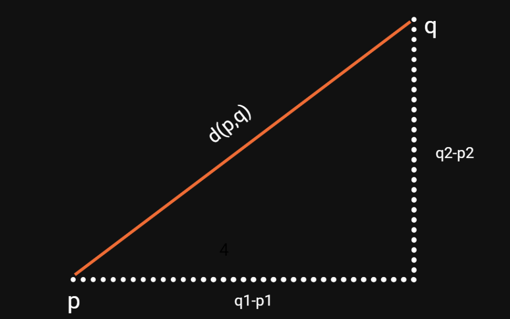
As you can see the indices refer to the axes. In this case, p1 and q1 are the x-values, whereas p2 and q2 are the y-values of the points. With our euclidean distance formula above, we can calculate this for n dimensions or axes. Also notice that it doesn’t matter if we subtract q from p or p from q, since we are squaring the difference afterwards.
Implementation in Python
Now that we know how to calculate the euclidean distance, we only need to put it into code and to select the nearest points for classification. So let us start with the imports.
import numpy as np
import matplotlib.pyplot as plt
from collections import Counter
Besides the two libraries, we have already talked about, we also import the Counter class from the collections library. This will make counting occurences in lists and arrays easier for us. Let us now start with defining our data.
points = {'blue': [[2,4], [1,3], [2,3], [3,2], [2,1]],
          'orange': [[5,6], [4,5], [4,6], [6,6], [5,4]]}

new_point = [3,3]
Here we create a dictionary with the name points and fill it with training data. This data is already classified, since every point belongs to either blue or orange. Then we also create a new point, which is not classified. This is the point which’s class we are going to predict.
To now build a K-Neighbors classifier, we will create a new class. This class will have a value set for k and also a method for training the model and predicting classes for new points.
class K_Nearest_Neighbors:

    def __init__(self, k=3):
        self.k = k

    def fit(self, points):
        self.points = points
In our constructor, we set a default value for k, which in this case is three. Feel free to change this value but notice that it may cause problems, if you choose an even number and encounter a tie situation. Training or fitting the model is very simple when it comes to the K-Nearest Neighbors algorithm. We just load the points into our class and that’s it. There are not parameters to adjust.
class K_Nearest_Neighbors:

    def __init__(self, k=3):
        self.k = k

    def fit(self, points):
        self.points = points

    def euclidean_distance(self, p, q):
        return np.sqrt(np.sum(np.array(p) - np.array(q)) ** 2)

    def predict(self, new_point):
        distances = []

        for category in self.points:
            for point in self.points[category]:
                distance = self.euclidean_distance(point, new_point)
                distances.append([distance, category])

        categories = [category[1] for category in sorted(distances)[:self.k]]
        result = Counter(categories).most_common(1)[0][0]
        return result
Now we get to the core of the algorithm, which is the prediction. Notice that we have defined a helper function here, which calculates the euclidean distance for us. Because we are using NumPy, we can just convert our lists into arrays and apply the operations on the whole points instead of calculating the values for each axis separately.
In our predict method, we define an empty list of distances. Here we will store all of the euclidean distance values for later use. What we do after that is, we iterate over the list of categories and over the points for each category. For every point we calculate the euclidean distance and we store the value with the respective class into our list.
After having done that for each point, we sort this list and pick the smallest k number of values from the list. We use the Counter class to get the one most common value and return this as a result. This is our class name.
clf = K_Nearest_Neighbors(k=3)
clf.fit(points)
print(clf.predict(new_point))
When we now apply our algorithm on our new point, we get a definite result:
blueVisualization and Plotting
Now that we know our model works, let’s visualize it and see what it looks like. So let us start by adjusting the design a little bit and make it darker. What we want is a NeuralNine feeling.
ax = plt.subplot()
ax.grid(True, color='#323232')

ax.set_facecolor('black')
ax.figure.set_facecolor('#121212')
ax.tick_params(axis='x', colors='white')
ax.tick_params(axis='y', colors='white')
We first define a subplot for our visualization. Then we set the facecolor of the subplot and of the figure to dark colors. The grid and the tick-parameters on the other hand get lighter colors. The next step is to scatter the actual training points.
[ax.scatter(point[0], point[1], color='#104DCA', s=60) for point in points['blue']]
[ax.scatter(point[0], point[1], color='#EF6C35', s=60) for point in points['orange']]
We use the scatter function to plot our points. Of course we assign a blue color to the points of the class blue and an orange color to the points of the class orange. If this is the first time that you see a for loop used in that notation, don’t get confused. We are just iterating over the list of points and plot the control variable.
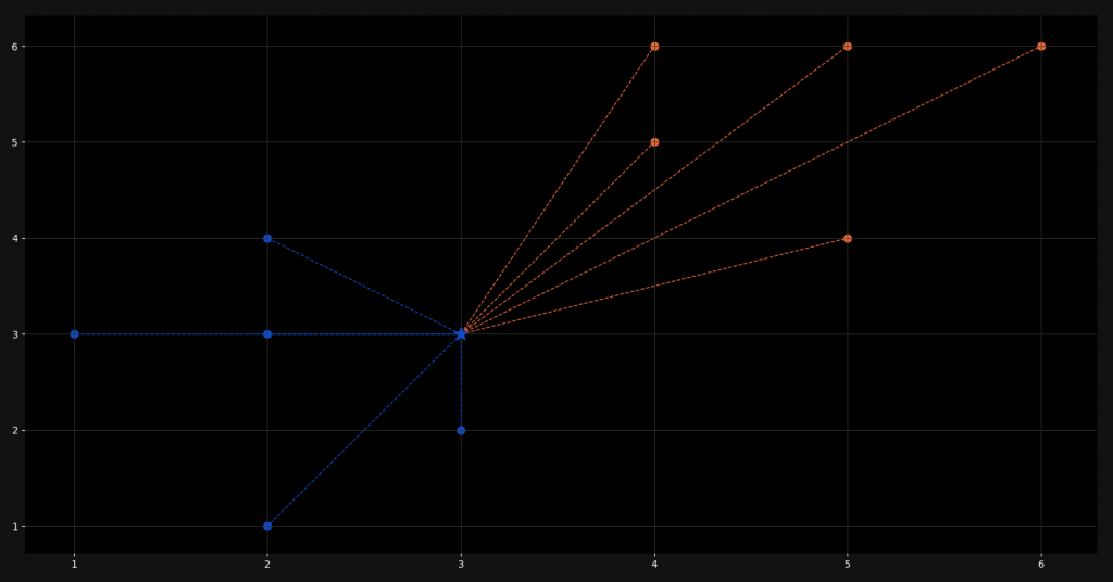
new_class = clf.predict(new_point)
color = '#EF6C35' if new_class == 'orange' else '#104DCA'
ax.scatter(new_point[0], new_point[1], color=color, marker='*', s=200, zorder=100)
What we do next is, we predict the class of our new point and store it. Then we choose the right color, depending on the class name. Here you can again see a not so common use of the if statement in Python. I am just a huge fan of efficient one-liners. However, we then plot our new point which is marked by a star but has the color of its predicted class.
[ax.plot([new_point[0], point[0]], [new_point[1], point[1]], color='#104DCA', linestyle='--', linewidth=1) for point in points['blue']]
[ax.plot([new_point[0], point[0]], [new_point[1], point[1]], color='#EF6C35', linestyle='--', linewidth=1) for point in points['orange']]

plt.show()
Last but not least, we plot the distances between the new point and all the other points. For this we used a dashed line and since we are plotting an actual line and not scattering points, we use the plot function. After showing the plot, this is what it looks like:
That’s it! We are done! I hope you enjoyed this blog post! If you want to tell me something or ask questions, feel free to ask in the comments! Check out my instagram page or the other parts of this website, if you are interested in more! Stay tuned!
Follow NeuralNine on Instagram: Click Here
Subscribe NeuralNine on YouTube: Click Here


Love your Content NeuralNine